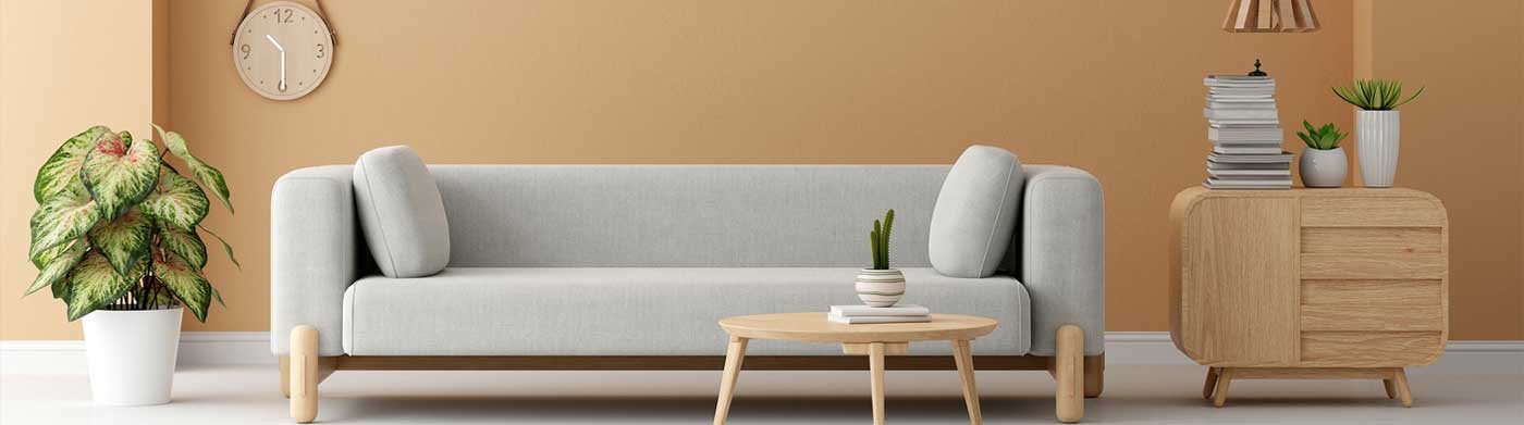

Have you ever walked into a room and immediately felt calm, energized, or even overwhelmed—without knowing why? That reaction is often triggered by color psychology.
At Prism Interiors, we believe color isn’t just about aesthetics—it’s a tool to influence emotions, set ambiance, and shape behavior. Whether you’re designing a cozy home or a productive office, choosing the right color palette can make a world of difference.
1. Blue – Calm, Focus, Trust
Where to use it: Bedrooms, bathrooms, home offices
Best for: Relaxation, clarity, productivity
Blue evokes a sense of peace, stability, and focus. Light blues are perfect for bedrooms, helping you wind down, while deeper navy blues add a touch of sophistication to study areas.
Interior tip: Pair soft blues with white or wood textures for a spa-like feel.
2. Green – Balance, Renewal, Freshness
Where to use it: Living rooms, kitchens, reading corners
Best for: Harmony, rejuvenation
Green connects us to nature. It brings a sense of freshness and balance, making it perfect for shared spaces. It’s also proven to reduce eye strain—ideal for workspaces.
Interior tip: Use indoor plants along with green accents to amplify the effect.
3. Red – Energy, Passion, Warmth
Where to use it: Dining rooms, accent walls, entryways
Best for: Energy, appetite, stimulation
Red is bold and emotional. It increases heart rate and can stimulate conversation and appetite, which makes it ideal for social zones. However, overuse may feel overwhelming.
Interior tip: Use red sparingly—on furniture, cushions, or feature walls.
4. Yellow – Optimism, Creativity, Light
Where to use it: Kitchens, playrooms, bathrooms
Best for: Cheerfulness, motivation
Yellow is like sunshine in a room. It uplifts the spirit and promotes creativity. It’s a popular choice for kitchens and children’s areas but should be balanced with neutral tones to avoid overstimulation.
Interior tip: Use pastel yellows in small spaces to make them feel larger and brighter.
5. Black – Elegance, Power, Sophistication
Where to use it: Accent walls, cabinetry, lighting fixtures
Best for: Depth, contrast
Black adds drama and timeless elegance when used right. It creates contrast and depth but should be balanced with lighter colors to avoid making the space feel closed in.
Interior tip: Try matte black fittings or hardware for a chic, modern look.
6. White – Cleanliness, Simplicity, Space
Where to use it: Everywhere!
Best for: Minimalism, spaciousness
White symbolizes purity and calm. It makes rooms appear larger and reflects natural light. It’s a blank canvas that can support any other color.
Interior tip: Layer whites with textures (like linen, jute, marble) to prevent it from feeling sterile.
7. Purple – Luxury, Spirituality, Creativity
Where to use it: Bedrooms, meditation corners, powder rooms
Best for: Calm luxury, inspiration
Purple has royal roots and spiritual overtones. Lighter lavenders soothe, while rich plums evoke luxury.
Interior tip: Use purple with gold or silver accents for a luxe vibe.
Final Thoughts: Choose What Feels Right
While color psychology is a powerful guide, it’s also deeply personal. The best interiors combine science with your unique taste and lifestyle.
At Prism Interiors, we help you discover the perfect palette—from moodboards to final execution, all managed under one roof.
Need Help Choosing the Right Colors for Your Space?
Book a free color consultation with our design experts today.
[Call Now] or [DM us on Instagram @prisminteriors]
 Next Post